


Bootstrap 5 Contact Form: Validation and Email, No Backend
A Bootstrap 5 contact form needs three things Bootstrap doesn't give you out of the box: a script that turns on its validation styles, error messages that screen readers can actually hear, and somewhere to send the data. Bootstrap is a CSS and component library. It styles the form, but it has no backend, so on a static site the submit button has nowhere to go.
This tutorial builds the whole thing in one HTML file. You'll use Bootstrap 5.3's needs-validation and was-validated classes, write your own error messages, submit with fetch(), and show the result in a Bootstrap alert without reloading the page. Submissions go to Static Forms, a form backend we make, which emails them to you.
If you only want markup to paste, the Bootstrap 5 contact form template is a plain form that posts to the same endpoint. This post covers what the template leaves out: validation, a JavaScript submit, and the accessibility gap in Bootstrap's own validation example.
Bootstrap facts below were checked against getbootstrap.com on 22 November 2026. The 5.3 docs list v5.3.9 as the current 5.x release. A v6.0.0 alpha is out, but this guide sticks to the stable 5.3 line.
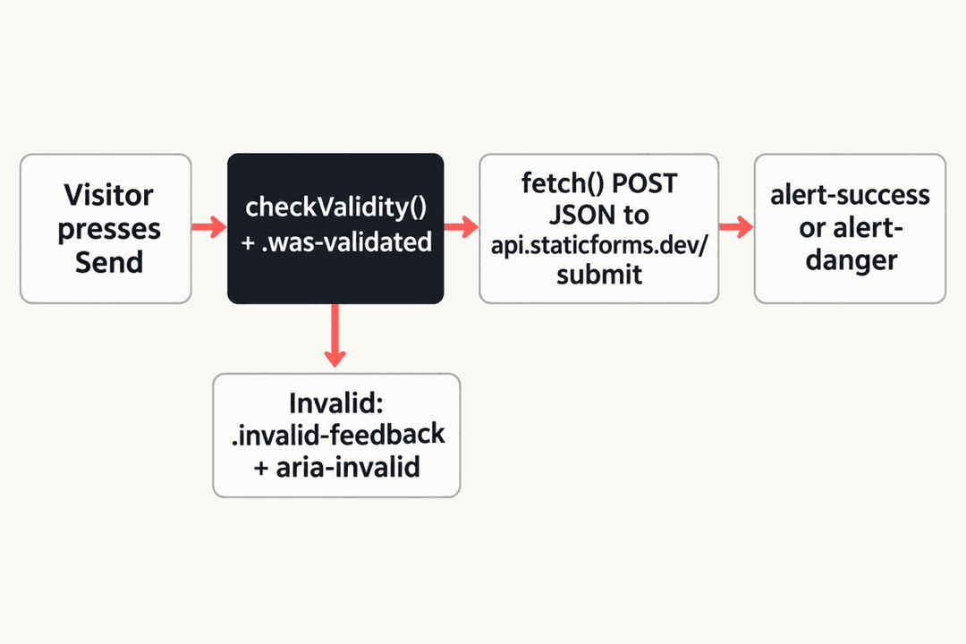
How Bootstrap 5 form validation works
Bootstrap's validation is CSS on top of the browser's built-in constraint validation. Nothing in it checks a field by itself.
- The browser decides what's valid. Attributes like
required,type="email"andminlengthmake a field match the:invalidor:validpseudo-class. - Bootstrap only styles the result, and only inside a parent with the
was-validatedclass. Without that scope, every empty required field would show red on page load. - Your script adds
was-validated, usually on the first submit attempt. Bootstrap's docs ship a short starter script that does this for every form with theneeds-validationclass. .invalid-feedbackand.valid-feedbackare sibling elements that appear when the field next to them is invalid or valid..is-invalidand.is-validare classes for results that come from a server. They work without awas-validatedparent.novalidateon the form turns off the browser's own error bubbles so Bootstrap's styles show instead. The validation API still works from JavaScript.
The accessibility gap in Bootstrap's example
The top of Bootstrap's validation page carries this warning: the client-side custom validation styles and tooltips "are not accessible, since they are not exposed to assistive technologies." A red border and a line of .invalid-feedback text look clear on screen, but nothing ties that text to the input, so a screen reader user tabbing through the form may never hear it.
Bootstrap's own advice for server-side errors is to link each message to its field with aria-describedby. We apply the same fix to client-side errors:
- every input points at its feedback element with
aria-describedby; - the script writes the error text into that element only when the field is invalid, so a valid field has an empty description;
- the script sets
aria-invalid="true"on fields that fail and removes it once they're fixed.
The form error messages guide explains this pattern in more depth if you want the reasoning behind each attribute.
Prerequisites
- A free Static Forms account and the API key for your form, from the dashboard. The Free plan accepts 250 submissions every 30 days for new Free accounts.
- A page you can open in a browser. Bootstrap loads from the jsDelivr CDN, so there's no build step.
The API key sits in your page source where anyone can read it. It identifies one form and can't read submissions or change settings.
Step 1: Load Bootstrap 5.3 from the CDN
These are the CSS tag and the JavaScript bundle tag from Bootstrap's getting-started page for v5.3.9, with the integrity hashes it publishes:
<!doctype html>
<html lang="en">
  <head>
    <meta charset="utf-8" />
    <meta name="viewport" content="width=device-width, initial-scale=1" />
    <title>Contact us</title>
    <link
      href="https://cdn.jsdelivr.net/npm/bootstrap@5.3.9/dist/css/bootstrap.min.css"
      rel="stylesheet"
      integrity="sha384-yEPZ7jP9S0QKiUQ0m3jjsO4ProIW7wvR9gXkI7JOGa2XVsw53Yke2bsdkBbjmmiX"
      crossorigin="anonymous"
    />
  </head>
  <body>
    <script
      src="https://cdn.jsdelivr.net/npm/bootstrap@5.3.9/dist/js/bootstrap.bundle.min.js"
      integrity="sha384-WyOxWvTyr1QaMPfiPJSv76iReVthorl5uWlFtZPyK0IEB0hGzo9y5Bp9mYanr8Bu"
      crossorigin="anonymous"
    ></script>
  </body>
</html>
You don't need the JavaScript bundle for this form. Validation styling is pure CSS, and the alert we show is never dismissed with Bootstrap's close button, so the complete example loads only the stylesheet. Add the bundle back if your page uses modals, dropdowns or dismissible alerts.
Each integrity hash belongs to one file at one version. If you change 5.3.9 in the URL, copy the new hash from Bootstrap's docs as well, or the browser will refuse to load the file.
Step 2: Write the form markup with Bootstrap classes
Each field gets a form-label, a form-control, and an empty invalid-feedback element right after the input. The empty element matters: Bootstrap only shows .invalid-feedback when it's a sibling that comes after an invalid input.
<form
  id="contact-form"
  class="needs-validation"
  action="https://api.staticforms.dev/submit"
  method="POST"
>
  <input type="hidden" name="apiKey" value="YOUR_API_KEY" />
  <input type="hidden" name="replyTo" value="@" />

  <div class="mb-3">
    <label for="name" class="form-label">Name</label>
    <input
      id="name"
      name="name"
      type="text"
      class="form-control"
      autocomplete="name"
      required
      aria-describedby="name-feedback"
    />
    <div id="name-feedback" class="invalid-feedback"></div>
  </div>

  <div class="mb-3">
    <label for="email" class="form-label">Email</label>
    <input
      id="email"
      name="email"
      type="email"
      class="form-control"
      autocomplete="email"
      required
      aria-describedby="email-feedback email-help"
    />
    <div id="email-feedback" class="invalid-feedback"></div>
    <div id="email-help" class="form-text">We only use this to reply to you.</div>
  </div>

  <div class="mb-3">
    <label for="message" class="form-label">Message</label>
    <textarea
      id="message"
      name="message"
      class="form-control"
      rows="5"
      minlength="10"
      required
      aria-describedby="message-feedback"
    ></textarea>
    <div id="message-feedback" class="invalid-feedback"></div>
  </div>

  <button type="submit" class="btn btn-primary">Send message</button>
</form>
A few details:
actionandmethodstay on the form, so it still posts if JavaScript fails to load. The visitor then sees Static Forms' default confirmation page instead of your alert.replyToset to@makes the notification email's Reply-To the address the visitor typed, so you can answer from your inbox.- The error id comes first in
aria-describedby, so a screen reader reads the problem before the hint. - There's no
novalidatein the HTML. Step 3 adds it from JavaScript. If the script never runs, the browser's own validation bubbles still stop an empty form from being sent.
The HTML form docs list the other hidden fields the endpoint accepts.
Step 3: Turn on validation with your own messages
Bootstrap's starter script adds was-validated and blocks the submit when checkValidity() fails. That's the right start, but it leaves the browser's default wording, which differs between browsers, and the accessibility gap from earlier.
This version keeps Bootstrap's approach and adds three things: messages you control, aria-invalid, and a check for fields that contain only spaces. The required attribute counts " " as filled in, and setCustomValidity() is how you make :invalid, and therefore Bootstrap's red styling, apply anyway.
const form = document.getElementById('contact-form');
form.noValidate = true; // set here so the browser's own checks still work without JavaScript

const fields = Array.from(form.querySelectorAll('[required]'));

const messages = {
  name: { valueMissing: 'Enter your name.' },
  email: {
    valueMissing: 'Enter your email address.',
    typeMismatch: 'Enter an email address like name@example.com.',
  },
  message: {
    valueMissing: 'Enter your message.',
    tooShort: 'Write at least 10 characters.',
  },
};

function setFeedback(field, text) {
  document.getElementById(field.id + '-feedback').textContent = text;
  if (text) field.setAttribute('aria-invalid', 'true');
  else field.removeAttribute('aria-invalid');
}

function checkField(field) {
  const rules = messages[field.name];
  field.setCustomValidity('');
  if (field.value.trim() === '') field.setCustomValidity(rules.valueMissing);

  let text = '';
  if (!field.validity.valid) {
    const state = Object.keys(rules).find((key) => field.validity[key]);
    text = state ? rules[state] : field.validationMessage;
  }
  setFeedback(field, text);
  return text === '';
}

form.addEventListener('submit', (event) => {
  event.preventDefault();
  const allValid = fields.map(checkField).every(Boolean);
  form.classList.add('was-validated');
  if (!allValid) fields.find((field) => !field.validity.valid).focus();
});

fields.forEach((field) => {
  field.addEventListener('input', () => {
    if (form.classList.contains('was-validated')) checkField(field);
  });
});
Errors don't appear until the first submit, because was-validated isn't on the form before then. After that, each field rechecks as the visitor types, so the message clears the moment the value is fixed.
minlength has one quirk to know about. Browsers only flag tooShort after the visitor has edited the field, which is always the case here, but a value you set from code won't trigger it.
If you'd rather skip JavaScript entirely, form validation without JavaScript shows how far the attributes get you on their own.
Step 4: Submit with fetch() and show a Bootstrap alert
Once every field passes, send the form as JSON and turn the response into an alert-success or alert-danger. Put the alert inside a container with role="status" that is in the page from the start, so screen readers announce the result without moving focus:
<div id="form-status" role="status" aria-live="polite"></div>The submit handler from Step 3 becomes:
const status = document.getElementById('form-status');
const button = form.querySelector('button[type="submit"]');

function showAlert(kind, text) {
  const alert = document.createElement('div');
  alert.className = 'alert alert-' + kind + ' mt-3 mb-0';
  alert.textContent = text;
  status.replaceChildren(alert);
}

form.addEventListener('submit', async (event) => {
  event.preventDefault();
  status.replaceChildren();

  const allValid = fields.map(checkField).every(Boolean);
  form.classList.add('was-validated');
  if (!allValid) {
    fields.find((field) => !field.validity.valid).focus();
    return;
  }

  button.disabled = true;
  button.textContent = 'Sending…';

  try {
    const response = await fetch(form.action, {
      method: 'POST',
      headers: { 'Content-Type': 'application/json', Accept: 'application/json' },
      body: JSON.stringify(Object.fromEntries(new FormData(form))),
    });
    const data = await response.json().catch(() => ({}));

    if (response.ok && data.success) {
      form.reset();
      form.classList.remove('was-validated');
      showAlert('success', 'Thanks, your message was sent. We will reply by email.');
    } else {
      showAlert('danger', data.error || 'Your message was not sent. Please try again in a minute.');
    }
  } catch (error) {
    showAlert('danger', 'We could not reach the form service. Check your connection and try again.');
  } finally {
    button.disabled = false;
    button.textContent = 'Send message';
  }
});
Two lines are easy to forget:
form.classList.remove('was-validated')after a success. Bootstrap's docs call this out for Ajax forms. Without it, the freshly reset empty fields light up red.form.reset()only runs on success. On an error the visitor keeps everything they typed.
A successful submission returns 200 with { "success": true, "message": "Form submitted successfully" }. Errors return success: false and an error string written to be readable, such as the rate-limit message on a 429. The API reference lists every status code, and the contact form API guide shows the exact error bodies.
Step 5: Add a honeypot field against spam bots
A honeypot is a text field that people never see and bots tend to fill in. Static Forms treats a field named honeypot as a trap and drops submissions where it has a value. Hide it off-screen rather than with d-none, and keep it out of the tab order:
<div class="position-absolute start-0" style="top: -10000px" aria-hidden="true">
  <label for="honeypot">Leave this field empty</label>
  <input id="honeypot" type="text" name="honeypot" tabindex="-1" autocomplete="off" />
</div>
It has no required attribute, so the validation script ignores it. The honeypot docs cover how it works and when to add a CAPTCHA as well.
Complete Working Example
Save this as contact.html, replace YOUR_API_KEY with the key from your dashboard, and open it in a browser. It combines every step: Bootstrap 5.3.9 from the CDN, a card layout, custom validation messages wired to aria-describedby, a honeypot, and a fetch() submit with Bootstrap alerts.
<!doctype html>
<html lang="en">
  <head>
    <meta charset="utf-8" />
    <meta name="viewport" content="width=device-width, initial-scale=1" />
    <title>Contact us</title>
    <link
      href="https://cdn.jsdelivr.net/npm/bootstrap@5.3.9/dist/css/bootstrap.min.css"
      rel="stylesheet"
      integrity="sha384-yEPZ7jP9S0QKiUQ0m3jjsO4ProIW7wvR9gXkI7JOGa2XVsw53Yke2bsdkBbjmmiX"
      crossorigin="anonymous"
    />
  </head>
  <body class="bg-body-tertiary">
    <main class="container py-5">
      <div class="row justify-content-center">
        <div class="col-md-8 col-lg-6">
          <div class="card shadow-sm">
            <div class="card-body p-4">
              <h1 class="h3 mb-4">Contact us</h1>

              <form
                id="contact-form"
                class="needs-validation"
                action="https://api.staticforms.dev/submit"
                method="POST"
              >
                <input type="hidden" name="apiKey" value="YOUR_API_KEY" />
                <input type="hidden" name="replyTo" value="@" />

                <div class="position-absolute start-0" style="top: -10000px" aria-hidden="true">
                  <label for="honeypot">Leave this field empty</label>
                  <input id="honeypot" type="text" name="honeypot" tabindex="-1" autocomplete="off" />
                </div>

                <div class="mb-3">
                  <label for="name" class="form-label">Name</label>
                  <input
                    id="name"
                    name="name"
                    type="text"
                    class="form-control"
                    autocomplete="name"
                    required
                    aria-describedby="name-feedback"
                  />
                  <div id="name-feedback" class="invalid-feedback"></div>
                </div>

                <div class="mb-3">
                  <label for="email" class="form-label">Email</label>
                  <input
                    id="email"
                    name="email"
                    type="email"
                    class="form-control"
                    autocomplete="email"
                    required
                    aria-describedby="email-feedback email-help"
                  />
                  <div id="email-feedback" class="invalid-feedback"></div>
                  <div id="email-help" class="form-text">We only use this to reply to you.</div>
                </div>

                <div class="mb-3">
                  <label for="message" class="form-label">Message</label>
                  <textarea
                    id="message"
                    name="message"
                    class="form-control"
                    rows="5"
                    minlength="10"
                    required
                    aria-describedby="message-feedback"
                  ></textarea>
                  <div id="message-feedback" class="invalid-feedback"></div>
                </div>

                <button type="submit" class="btn btn-primary w-100">Send message</button>
                <div id="form-status" role="status" aria-live="polite"></div>
              </form>
            </div>
          </div>
        </div>
      </div>
    </main>

    <script>
      const form = document.getElementById('contact-form');
      form.noValidate = true; // set here so the browser's own checks still work without JavaScript

      const fields = Array.from(form.querySelectorAll('[required]'));
      const status = document.getElementById('form-status');
      const button = form.querySelector('button[type="submit"]');

      const messages = {
        name: { valueMissing: 'Enter your name.' },
        email: {
          valueMissing: 'Enter your email address.',
          typeMismatch: 'Enter an email address like name@example.com.',
        },
        message: {
          valueMissing: 'Enter your message.',
          tooShort: 'Write at least 10 characters.',
        },
      };

      function setFeedback(field, text) {
        document.getElementById(field.id + '-feedback').textContent = text;
        if (text) field.setAttribute('aria-invalid', 'true');
        else field.removeAttribute('aria-invalid');
      }

      function checkField(field) {
        const rules = messages[field.name];
        field.setCustomValidity('');
        // required accepts a value of only spaces, so flag it ourselves
        if (field.value.trim() === '') field.setCustomValidity(rules.valueMissing);

        let text = '';
        if (!field.validity.valid) {
          const state = Object.keys(rules).find((key) => field.validity[key]);
          text = state ? rules[state] : field.validationMessage;
        }
        setFeedback(field, text);
        return text === '';
      }

      function showAlert(kind, text) {
        const alert = document.createElement('div');
        alert.className = 'alert alert-' + kind + ' mt-3 mb-0';
        alert.textContent = text;
        status.replaceChildren(alert);
      }

      fields.forEach((field) => {
        field.addEventListener('input', () => {
          if (form.classList.contains('was-validated')) checkField(field);
        });
      });

      form.addEventListener('submit', async (event) => {
        event.preventDefault();
        status.replaceChildren();

        const allValid = fields.map(checkField).every(Boolean);
        form.classList.add('was-validated');
        if (!allValid) {
          fields.find((field) => !field.validity.valid).focus();
          return;
        }

        button.disabled = true;
        button.textContent = 'Sending…';

        try {
          const response = await fetch(form.action, {
            method: 'POST',
            headers: { 'Content-Type': 'application/json', Accept: 'application/json' },
            body: JSON.stringify(Object.fromEntries(new FormData(form))),
          });
          const data = await response.json().catch(() => ({}));

          if (response.ok && data.success) {
            form.reset();
            form.classList.remove('was-validated');
            showAlert('success', 'Thanks, your message was sent. We will reply by email.');
          } else {
            showAlert('danger', data.error || 'Your message was not sent. Please try again in a minute.');
          }
        } catch (error) {
          showAlert('danger', 'We could not reach the form service. Check your connection and try again.');
        } finally {
          button.disabled = false;
          button.textContent = 'Send message';
        }
      });
    </script>
  </body>
</html>
Test it before you publish
Run through these checks in a browser:
- Press Send message with every field empty. All three fields turn red, each shows its own message, and focus moves to Name.
- Type
name@in Email. The message changes to the format hint, then clears once the address is complete. - Type only spaces in Name. It stays invalid.
- Fill the form correctly and send. A green alert appears, the fields empty, and none of them turn red.
- Open the Network tab and confirm one
POSTtoapi.staticforms.dev/submitwith a200response, then check your inbox. - Change the API key to a wrong value and send. A red alert shows the API's error text, and your typing is still there.
- Tab through the form with a screen reader on and listen for the error after each field's label.
Troubleshooting
Every field is red as soon as the page loads. Something added was-validated too early, or the fields use .is-invalid in the HTML. Only add was-validated in the submit handler.
The browser's own bubble appears instead of Bootstrap's message. The script didn't run, so noValidate was never set. Check the console for an error above the submit handler.
The red border shows but no message appears. The .invalid-feedback element has to come after the input as a sibling, at the same level. Wrapping the input in another div breaks Bootstrap's sibling selector. Input groups also need the has-validation class on the .input-group.
The form fields turn red after a successful send. Remove was-validated after form.reset(), as in Step 4.
The CSS doesn't load and the console mentions integrity. The integrity hash doesn't match the file. Copy the URL and the hash together from Bootstrap's docs for the version you use.
Nothing arrives in the inbox. Check that apiKey holds your form's key, look for the submission in the dashboard, and read the error text in the red alert. Contact form not sending email lists the other usual causes.
FAQ
Does Bootstrap 5 send contact form emails?
No. Bootstrap styles the form and has no server component. To get submissions by email you need a backend: your own server script, or a form backend service like Static Forms that receives the POST and emails it to you.
Do I need jQuery for a Bootstrap 5 contact form?
No. The validation and fetch() code in this guide is plain JavaScript, and the complete example doesn't load any Bootstrap JavaScript at all. If an older tutorial uses $.ajax, the fetch() call in Step 4 replaces it.
What's the difference between was-validated and is-invalid?
was-validated goes on the form and tells Bootstrap to style every field from the browser's own :valid and :invalid state. is-invalid and is-valid go on single fields and set the state directly, which is what you use for errors that come back from a server.
Is Bootstrap's built-in validation accessible?
Not on its own. Bootstrap's docs say the client-side custom styles aren't exposed to assistive technologies. Link each .invalid-feedback element to its input with aria-describedby, set aria-invalid on failing fields, and move focus to the first error, as the complete example does.
Next steps
Paste your API key into the complete example and send yourself a test. If your site uses Tailwind instead, the Tailwind CSS contact form covers the same form with utility classes. When you're ready to add more fields or a file upload, the HTML form docs list everything the endpoint accepts.
Related Articles
Contact Form on a Static WordPress Site (Simply Static)
Add a contact form to a static WordPress site that survives a Simply Static or WP2Static export: why plugin forms break, the HTML fix and how to test it.
Next.js Server Actions vs a Form Endpoint for Contact Forms
Compare Next.js Server Actions and managed form endpoints with tested contact form code, static export limits, security checks, and deployment trade-offs.
Build a Custom Shopify Contact Form Section in Liquid
Build a reusable Shopify contact form section in Liquid. Add custom fields, accessible errors, native hCaptcha, theme settings, and a storefront test.